[Case 04]
ActivePorto: UX Research and Prototyping for Outdoor Fitness
Health & Fitness
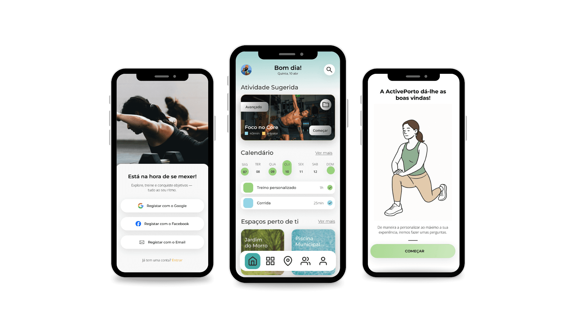
ActivePorto
Personalized Outdoor Fitness in Porto
[Project Overview]
ActivePorto is a conceptual mobile app designed to recommend the best outdoor spaces in the Porto Metropolitan Area for physical activity. The project explored how GIS (Geographic Information Systems) data could enhance personalized fitness recommendations. Developed in Figma, the prototype focuses on creating a motivating and user-centered experience that encourages healthier routines through intelligent location-based insights.
[Problem Statement]
Despite Porto’s strong potential for outdoor exercise, many residents struggle to find reliable information about suitable places for physical activity. The lack of accessible, structured guidance contributes to low participation rates and inactivity—contradicting WHO recommendations. The challenge was to design a solution that empowers citizens with clear, personalized suggestions that make outdoor exercise easier and more appealing.
[Industry]
Health & Fitness
[My Role]
UX Researcher & Designer
[Platforms]
Mobile App (Prototype in Figma)
[Timeline]
February 2025 – May 2025
[Persona]

Xavier Alonso
University Student
Young adult recovering from a knee injury, motivated to exercise outdoors safely and stay active without feeling excluded.
Age: 23
Condition: Low Mobility
Tech Proficiency: High
Gender: Male
[Goal]
Maintain mobility and well-being while staying safe.
Find outdoor locations where he feels included and comfortable.
Build a sustainable routine of light exercises that fits his daily life.
[Frustrations]
No clear info about accessibility (ramps, stairs, terrain type).
Fitness apps suggesting routes with difficult or unsafe terrain.
Feeling excluded when friends use apps he can't.
[Process]
[01] User Research
Competitor analysis of leading fitness apps.
Development of personas and user journey maps.
Development of personas and user journey maps.
[02] Insights
Users value strong personalization (goals, preferences, type of training).
Need for clearer terminology (“training” vs. “exercise”) to reduce friction.
High interest in community features and progress comparison.
[03] Design Solution
Figma prototype with onboarding, location recommendations, exercises, and community features.
Information architecture structured for future GIS integration by another team member.
[04] Testing & Iteration
Usability testing with 5 participants matching personas.
Tools: UEQ (attractiveness, clarity, efficiency, etc.) + observation grid.
Outcomes: consistently positive evaluations (above +1.0 across several dimensions).
[Outcome]
Prototype validated with positive feedback on usability, clarity, and visual appeal.
Critical improvements identified for future iterations, particularly around route clarity and personalization.
Prototype prepared for future GIS integration, supported by user feedback confirming the relevance of accessibility-focused features.
[Key Learnings]
Local context matters
Designs grounded in the real dynamics of a city increase relevance and adoption.
Clarity is key
Simple, familiar language reduces cognitive load and improves onboarding.
Community drives motivation
Digital community spaces support long-term engagement and healthier routines.